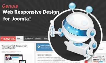 Resize browser to see the magic. And experience the ride with your wide screen, laptop, ipad, kindle, iphone or any handheld device.
Mobile layout
- Details
- Category: Template guide
- Published: Monday, 28 November 2011 07:23
- Hits: 138
There are 2 layout types for mobile. The first one is Tablet Portrait layout and Tablet Lanscape layout ( the Landscape layout is the Normal Layout). The mobile layout uses percentage (%) as unit to define width of the layout. The full width of the layout is 100%, from that, you can define width for each element in the template.
Mobile Landscape layout
Front-end Appearance
To define width of the layout, please navigate to: [your_site] / templates / ja_elastica / core / etc / layouts / default.xml. The file default.xml is to define width range of each layout.
Tablet layout
- Details
- Category: Template guide
- Published: Monday, 28 November 2011 07:23
- Hits: 185
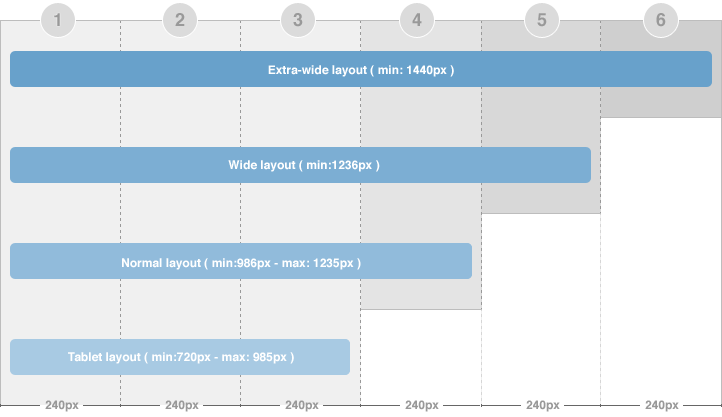
There are 2 layout types for tablet. The first one is Tablet Portrait layout and Tablet Lanscape layout ( the Landscape layout is the Normal Layout).
The Portrait layout uses 3 grids. The content block has width of 3 grids in both homepage and detail page so all modules will be displayed under the content block.
Normal layout
- Details
- Category: Template guide
- Published: Monday, 28 November 2011 07:22
- Hits: 221
The normal layout uses 4 grids. In Homepage, the content block width = 2 grids. In Detail page mode, the content block width = 3 grids.
How the modules are changed when layout is changed from Wide layout to Normal layout?
The modules in the grid 5 (in Wide layout) will be moved to available grids in Normal layout [grid 3 and 4 or under the content block (in Homepage) and grid 4 or under the content block (in detail page)] in the order from left to right. The moved modules will be located under the modules already in the grids.
Wide layout
- Details
- Category: Template guide
- Published: Monday, 28 November 2011 07:22
- Hits: 207
This layout is quite similar to the extra-wide layout, except the extra-column is removed.
To define width of the layout, please navigate to: [your_site] / templates / ja_elastica / core / etc / layouts / default.xml. The file default.xml is to define width range of each layout.
Extra-wide layout
- Details
- Category: Template guide
- Published: Monday, 28 November 2011 05:01
- Hits: 348
There are 2 width size modes of the content block: in Homepage (considered as list page mode) and in detail page mode. In the Homepage, the width of the content block = 2 grids while in the detail page mode, the width of content block is 3 grids. The above image shows you the layout of homepage of our template --> content block = 2 grid.

 Etiam pellentesque magna id lacus imperdiet ac vulputate enim semper. Donec tincidunt.